Custom Waistband Design: Branding, Elastic, and Logo Placement
Most brands treat waistband customization as a design task. They pick a logo style because it looks good, then figure out production later. That order of thinking is expensive.
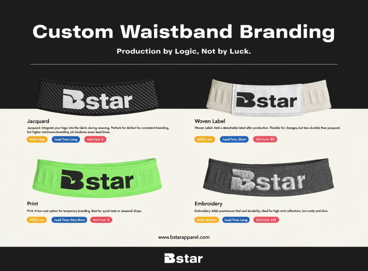
Waistband customization is a branding decision tied directly to your brand’s current stage. The technique you choose — jacquard, woven label, print, or embroidery — determines your MOQ, your tooling lead time, and your unit cost before sampling even begins. Get the match wrong, and you pay for it before a single unit ships.
We handle custom waistband requests regularly at BSTAR — from early-stage DTC brands placing their first order to established e-commerce sellers scaling up a core product. The mistakes we see most often don’t happen because someone had bad taste. They happen because the technique didn’t match the brand’s actual situation. This article walks through the four decisions that matter most before you commit to a sampling fee.
Elastic Selection: How Do You Choose the Right Elastic for Your Garment?
Brands often treat elastic selection as a comfort question. They ask: "Will this feel good on the body?" That’s part of it. But elastic spec also sends a signal at retail — before the customer even tries the product on.
The width, tension, and surface texture of your waistband elastic directly shape how your finished product is perceived.1 A narrow, soft elastic reads differently than a wide, structured one. Both can be "comfortable," but they position your product at completely different price points in the customer’s mind.
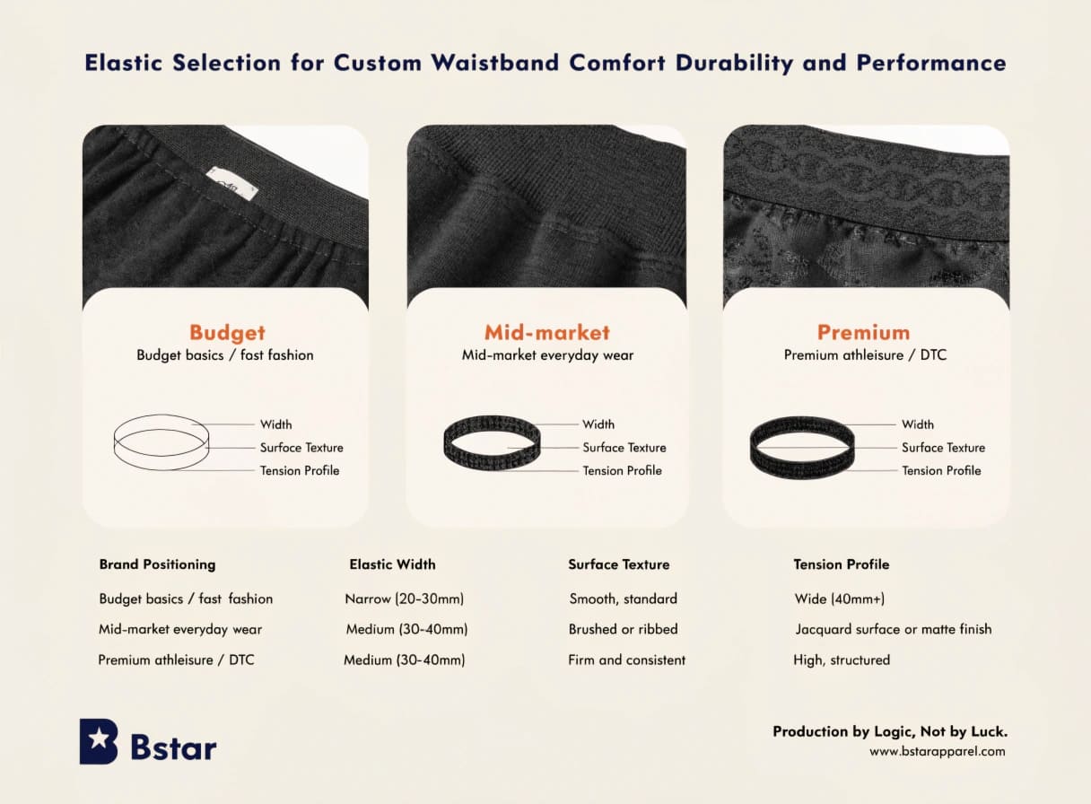
This is a distinction that matters a lot for brands in the athleisure or premium basics space. We’ve worked with clients who had clean, well-executed logo work but used a commodity-grade elastic underneath. The finished product felt budget at the waistline — and that perception is hard to fix downstream.
What to consider at each brand positioning level
| Brand Positioning | Elastic Width | Surface Texture | Tension Profile |
|---|---|---|---|
| Budget basics / fast fashion | Narrow (20–30mm) | Smooth, standard | Moderate |
| Mid-market everyday wear | Medium (30–40mm) | Brushed or ribbed | Firm and consistent |
| Premium athleisure / DTC | Wide (40mm+) | Jacquard surface or matte finish | High, structured |
The point here is simple. If your brand is positioning for premium athleisure, the elastic spec needs to carry that positioning — not just the logo placement. A well-placed logo on a cheap-feeling elastic band still reads as cheap.2 The waistband is a system. Every element needs to match.
If you’re at the stage where you’re still testing a product concept and cost is tight, a clean mid-market elastic with a printed label is a reasonable starting point. The decision to upgrade the elastic spec makes more sense once you’re scaling a proven SKU.
Branding Techniques: Which Logo Method Actually Fits Your Brand Stage?
This is where we see the most expensive mismatch. A brand founder sees a jacquard waistband on a competitor’s product, decides that’s the look they want, and locks in the technique before checking the MOQ or tooling timeline.
Jacquard, woven labels, print, and embroidery differ sharply in tooling cost, minimum order quantity, and lead time. Choosing the wrong technique for your current stage doesn’t just affect cost — it can kill an order before sampling completes.
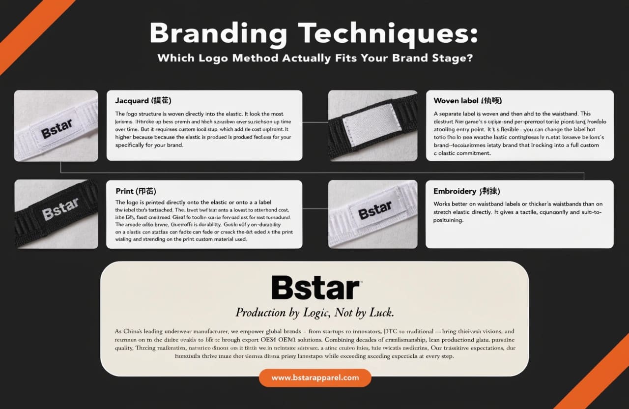
Here’s how we typically map each technique to brand stage in practice.
Technique-to-stage mapping
Jacquard (提花) — The logo structure is woven directly into the elastic. It looks the most premium and holds up best over time. But it requires custom loom setup, which adds cost and time upfront. MOQ requirements are higher because the elastic is produced specifically for your brand. This technique fits brands that have a confirmed product, a clear order volume, and the runway to absorb tooling costs. It is not the right starting point for a first sampling project on a new style.
Woven label (织唛) — A separate label is woven and then attached to the waistband. This gives you a clean, high-end finish at a lower tooling entry point than jacquard. It’s flexible — you can change the label without retooling the elastic. This is a strong choice for mid-to-established brands that want brand consistency without locking into a full custom elastic commitment.
Print (印花) — The logo is printed directly onto the elastic or onto a label that’s attached to it. Lowest tooling cost, fastest turnaround. Good for early-stage brands or test runs. The tradeoff is durability — printed logos on elastic surfaces can fade or crack with repeated washing and stretching, depending on the print method and elastic material used3.
Embroidery (刺绣) — Works better on waistband labels or thicker fabric waistbands than on stretch elastic directly. It gives a tactile, quality feel and suits mid-to-premium positioning. Lead time and per-unit cost are moderate.
If you’re placing your first custom order, the decision is usually between print and woven label. Jacquard is for when you’ve validated the product and you’re ready to invest in a signature elastic.
Strategic Logo Placement: Where Should Your Logo Actually Go?
The instinct is to make the logo visible. The execution is often to make it bigger. That’s the wrong direction for most brand positioning goals.
Oversized logos on waistbands typically read as mass-market or fast fashion. Premium and mid-tier brands consistently use restrained placement — small interior labels, tonal woven logos, or edge-positioned details.4 Visibility isn’t the same as brand strength.
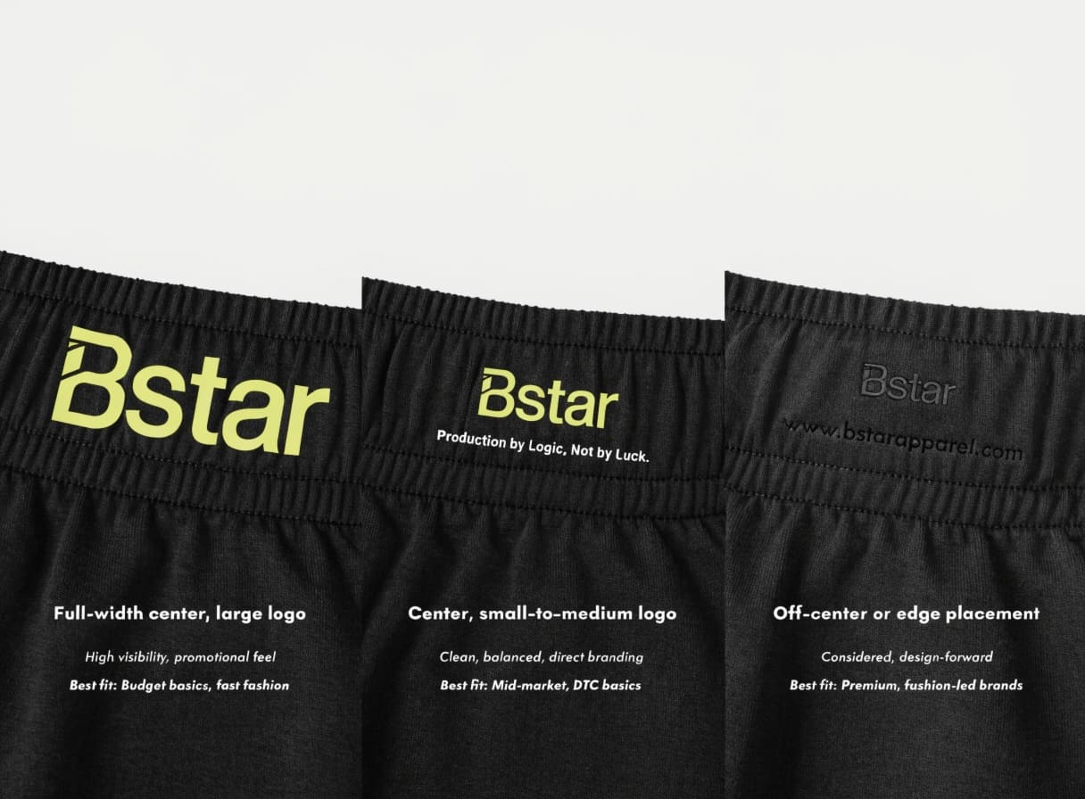
We’ve seen this pattern repeatedly in sampling reviews. A client submits a logo file that’s sized for maximum coverage on the waistband. The sample comes back and it looks promotional, not branded. The revision — scaling the logo down and repositioning it — is what gets approved for production.
Common placement options and what they signal
| Placement | Signal | Best Fit |
|---|---|---|
| Full-width center, large logo | High visibility, promotional feel | Budget basics, fast fashion |
| Center, small-to-medium logo | Clean, balanced, direct branding | Mid-market, DTC basics |
| Off-center or edge placement | Considered, design-forward | Premium, fashion-led brands |
| Interior waistband label only | Subtle, quality-focused | Premium basics, underwear, loungewear |
| Tonal woven logo (same color) | Restrained, high-end feel | Athleisure, elevated basics |
The real branding lever is consistency and finish quality. A small, well-placed logo on a well-spec’d elastic with clean stitching signals more than a large logo on a mid-grade base. If you’re building a brand for the long term, restraint in placement usually ages better than coverage.
Customization Essentials: How Do Width, Texture, and Color Tie Back to Brand Identity?
Most customization briefs focus on the logo. The width, texture, and color of the base elastic are treated as secondary decisions. In practice, they’re what make the logo work — or undermine it.
The elastic base — its width, surface texture, and color — determines whether your branding technique reads the way you intended. A tonal woven logo on a mismatched base color loses all its subtlety. A wide, structured elastic with a tiny printed label looks unbalanced. These elements need to be decided together.
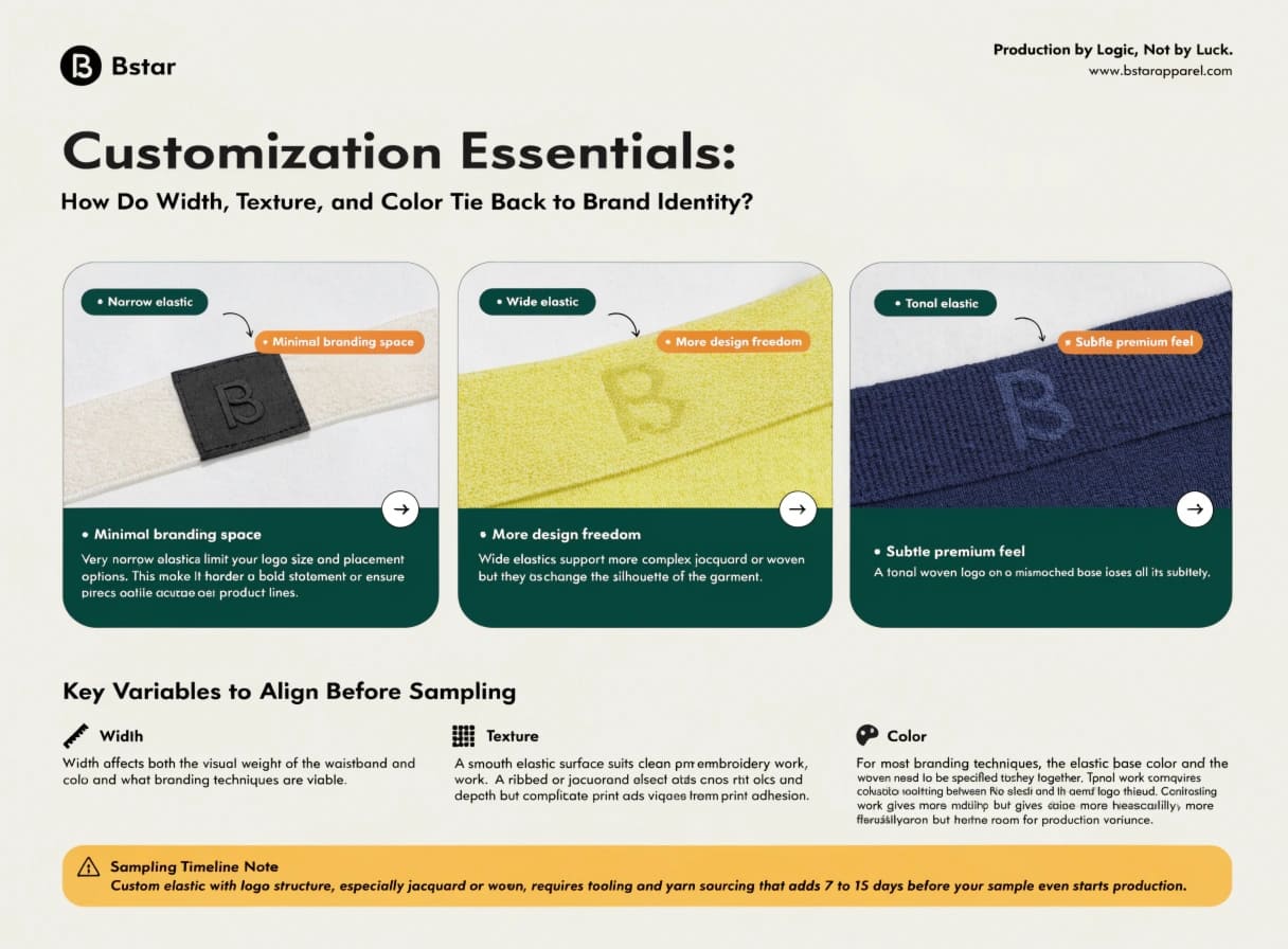
One thing we see often is brands selecting elastic color from a standard swatch card without checking how it translates to their garment fabric. Black-on-black can work beautifully if the elastic finish matches the fabric finish. If one is matte and the other is shiny, the waistband stands out for the wrong reason.5
Key variables to align before sampling
Width — Width affects both the visual weight of the waistband and what branding techniques are viable. Very narrow elastics limit your logo size and placement options. Wide elastics support more complex jacquard or woven work, but they also change the silhouette of the garment.
Texture — A smooth elastic surface suits clean print or embroidery work. A ribbed or jacquard surface adds visual depth but can complicate print adhesion.6 Match the surface to your intended technique, not the other way around.
Color — For most branding techniques, the elastic base color and the logo color need to be specified together. Tonal work requires close color-matching between the elastic yarn and the logo thread. Contrasting work gives you more flexibility but also more room for production variance.
Sampling timeline note — Custom elastic with logo structure, especially jacquard or woven, requires tooling and yarn sourcing that adds 7 to 15 days before your sample even starts production.7 If you’re planning a launch date and you haven’t accounted for this, you’ll find out during sampling — not before. Build this into your timeline from the start.
If your brand identity is still forming, keep the elastic spec simple and focus your customization budget on logo execution quality. If you have a clear, established identity, the elastic spec is where you can reinforce positioning in a way customers feel before they read a single word.
Conclusion
Waistband customization decisions — technique, placement, elastic spec — should match your brand stage and positioning, not just your aesthetic preference. Get the match right before you pay for sampling.
-
"How multisensory perception promotes purchase intent in the … – PMC", https://pmc.ncbi.nlm.nih.gov/articles/PMC9816429/. Research in sensory marketing and haptic perception demonstrates that touch-based product evaluation is a primary quality inference mechanism for textile goods; attributes including fabric hand, structural firmness, and surface texture are processed as quality signals that influence purchase intent and perceived value (cf. Peck & Childers, 2003, on the role of touch in consumer product evaluation). Evidence role: mechanism; source type: paper. Supports: That tactile and visual properties of textile components — including surface texture, structural firmness, and width — function as sensory quality cues that consumers use to evaluate and infer overall garment quality.. Scope note: Published haptic research ↩
-
"Consumers’ conceptualization of apparel attributes and apparel quality", https://www.academia.edu/21082751/Consumers_conceptualization_of_apparel_attributes_and_apparel_quality. Consumer research on multi-attribute quality evaluation suggests that quality perception is not simply additive; salient low-quality cues — particularly those involving tactile or haptic feedback — can anchor overall product judgments downward, a pattern related to negativity bias in product evaluation (cf. research on asymmetric weighting of negative versus positive product attributes). Evidence role: mechanism; source type: paper. Supports: That overall product quality perception can be disproportionately influenced by the lowest-quality component, limiting the ability of high-quality elements to elevate total perceived value.. Scope note: The specific claim about elastic waistbands is an application of general consumer psychology principles; direct empirical studies on waistband material as a quality anchor are not available in published literature. ↩
-
"Achieving Highly Conductive, Stretchable, and Washable …", https://www.lamp.pitt.edu/Publications/054.pdf. Textile testing standards such as ISO 105-C06 (colour fastness to domestic and commercial laundering) and AATCC 135 address wash-induced degradation of surface treatments; the additional mechanical stress of cyclic stretching on elastic substrates further accelerates ink film fatigue and delamination relative to woven or knit base fabrics. Evidence role: mechanism; source type: institution. Supports: That printed graphics on elastic substrates are subject to adhesion failure, cracking, and color loss under repeated mechanical stretching and laundering cycles.. Scope note: Published standards address color fastness broadly; specific quantitative data on print failure rates for logo graphics on narrow elastic bands under combined stretch-and-wash conditions is not widely available in open literature. ↩
-
"Understanding the effect of brand identity driven by consumer … – PMC", https://pmc.ncbi.nlm.nih.gov/articles/PMC9521331/. Academic work on conspicuous consumption and brand signaling — including studies on logo size as a status signal — documents that premium and luxury brands strategically employ understated branding to signal exclusivity, while high-visibility logos are more prevalent in accessible or aspirational mass-market positioning (cf. Han, Nunes & Drèze, 2010, on ‘quiet’ versus ‘loud’ luxury signals). Evidence role: expert_consensus; source type: paper. Supports: That logo prominence and visibility are systematically associated with brand tier positioning, with luxury and premium brands favoring subtle or tonal branding while mass-market brands use high-visibility logo treatments.. Scope note: Existing research focuses primarily on outerwear and accessories rather than intimate apparel waistband placement specifically; the directional finding is well-supported but the waistband context is an extrapolation. ↩
-
"Color appearance shifts depending on surface roughness … – PMC", https://pmc.ncbi.nlm.nih.gov/articles/PMC8789860/. Textile color science distinguishes between colorimetric match and visual match; two fabrics with identical dye formulations may appear different when their surface structures differ in reflectance geometry (e.g., matte versus satin finish), a phenomenon related to goniochromism and surface scattering that is well-documented in color measurement standards such as CIE guidelines on textile color evaluation. Evidence role: mechanism; source type: education. Supports: That surface finish differences between adjacent textile components — specifically differences in light reflectance or sheen — produce visible contrast even when colorimetric values are matched, because perceived color appearance is a function of both pigment and surface geometry.. Scope note: Published literature addresses this phenomenon in the context of color measurement and quality control rather than specifically in the context of elastic-to-fabric waistband matching in garment assembly. ↩
-
"Increasing adhesion of 3D printing on textile fabrics by polymer …", https://hero.epa.gov/reference/11106981/. Printing and coating science literature documents that substrate surface roughness and porosity are primary determinants of ink adhesion and print definition; on textured woven surfaces, ink bridges across raised yarn interstices rather than forming a continuous film, reducing adhesion strength and print edge sharpness relative to smooth substrates. Evidence role: mechanism; source type: paper. Supports: That surface topography of a textile substrate affects ink film formation and adhesion, with irregular or raised surface structures reducing contact area and creating uneven ink deposition compared to smooth substrates.. Scope note: Most published research addresses paper, film, or flat textile substrates; specific data on ink adhesion to narrow jacquard or ribbed elastic is not widely available in open academic literature. ↩
-
"Warp tension analysis of narrow fabric weaving and designing of …", https://www.academia.edu/113668074/Warp_tension_analysis_of_narrow_fabric_weaving_and_designing_of_tension_compensator_to_avoid_start_up_marks. Industry sourcing guides and manufacturer documentation for narrow elastic production consistently note that custom loom setup — including jacquard card or electronic loom programming and specialty yarn procurement — introduces pre-production lead time prior to sample weaving, with typical ranges varying by factory capacity, yarn availability, and design complexity. Evidence role: general_support; source type: other. Supports: That custom narrow elastic production involving loom programming, yarn procurement, and trial weaving introduces pre-sampling lead time measured in days to weeks.. Scope note: The specific 7–15 day figure cited in the article is not independently verifiable from public sources; actual lead times vary substantially by supplier, region, and order complexity. ↩